
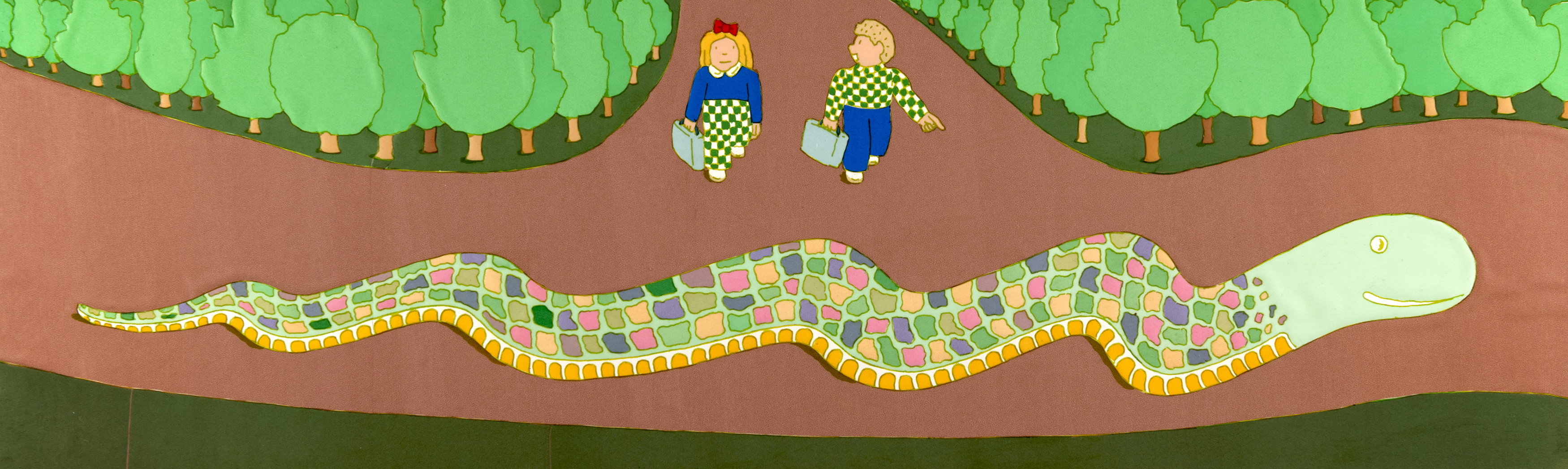
Seymour Chwast, Illustration for Tall City, Wide Country (Creative Editions). Seymour Chwast Collection, Washington University Libraries, Department of Special Collections. © 2013 Seymour Chwast.
The Alphabet and Other Magic Shows You Won't Want to Miss: The Beguiling Picture Book Art of Seymour Chwast
Asked once what he would have done had a career in graphic art not worked out for him, Seymour Chwast replied: “I would have opened a candy store.”1 Chwast’s Plan B never proved necessary, of course, but the mere mention of it is enough to conjure up a vivid portrait of the artist Chwast became: the quirky humorist and pragmatic, out-of-the-box problem-solver; the uninhibited, confectionery colorist; the natural-born storyteller who never forgot what it is like to be a child.
Born in the Bronx and raised in Coney Island during the Great Depression, Chwast (pronounced Kwahst) learned to read, write, and draw from comic books and the Sunday funny papers, the latter including his favorite cartoon strip: Zack Mosley’s tales of daredevil aviator Smilin’ Jack. His mother recalled that her precocious young son drew his earliest artwork—a picture of the head of a woman—with a mascara pencil as he sat in a beauty parlor waiting area. Disney’s Snow White and the Seven Dwarfs prompted dreams of an animation career that ended only when he realized it would mean leaving New York, which to Chwast seemed an unimaginably high price to pay.
At Brooklyn’s Abraham Lincoln High School, an inspired, German-born art teacher named Leon Friend introduced Chwast and fellow members of Friend’s hand-picked “Art Squad” to the world of design—its honorable history, arsenal of techniques and practices, and menu of career options.2 Friend also instilled in his students an idealistic belief in the value to society of communication through effective graphic design. Chwast created his first posters as assignments for Friend as well as his first children’s book, a revolt-of-the-animals fable called Farmer Gooseby Gives In, which may have been sparked by a reading of George Orwell. Always on the lookout for chances to help his students advance themselves, Friend urged Chwast to enter an art contest sponsored by Seventeen magazine. His drawing won and became his first published work. Chwast’s parents also warmly supported his dream of a future in art. As working-class people without much money of their own, it must have relieved them to know he had taken Leon Friend’s message to heart and decided on a design career that might earn him a living.
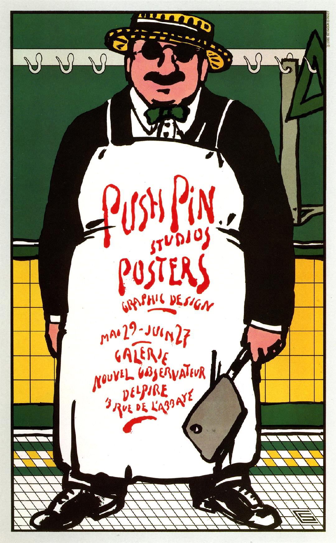
From high school, Chwast headed off to Cooper Union, New York’s free art college, where he studied printmaking and typography and forged creative partnerships with fellow students Milton Glaser, Edward Sorel, and Reynolds Ruffin. Within a few years of their 1951 graduation, these four friends had all played key roles in the founding of Push Pin Studios, which rapidly established itself as a global design powerhouse with a maverick, proto-postmodern sensibility.3 With Chwast and Glaser at the helm, Push Pin went on to revolutionize the look and feel of entire categories of graphics ranging from book jackets and poster design to product packaging and illustration art across all media. Summing up the firm’s immense impact and singular aura, historian Steven Heller has observed: “The studio was like the Beatles of illustration and design.”4
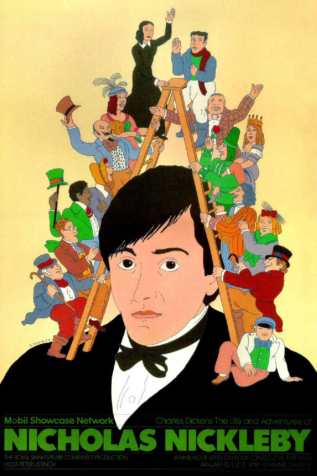
Seymour Chwast, Poster for Nicholas Nickleby, The Royal Shakespeare Company’s Production, Mobile Network. Courtesy of Seymour Chwast. © 1983 Seymour Chwast.
Chwast came of age professionally just as New York overtook Paris and other European cultural centers as the world capital of art and design. On the design side, Modernist ideals imported from Europe largely set the post-war agenda. Sleek, minimalist, and adamantly ahistorical, the Modernist aesthetic in all its many iterations called for a clean break with the ornate decorative styles of the past in favor of a frill-free, less-is-more, universal visual language. The problem for some critics with this often dynamic and forward-leaning approach was that it could also feel quite chilly. As a student, Chwast had fallen in love with a sumptuous grab bag of historical styles and influences—Victorian wood type, Art Nouveau poster art, and German Expressionist printmaking, to name a few. On surveying the dominant design landscape in which they found themselves, Chwast and his Push Pin colleagues came to the same exhilarating conclusion: why toss out the past when you can have fun playing with it instead?
Push Pin became known for its deft, eclectic, hipster brand of “illustrative design” and Chwast himself for the buoyant wit and offhand grace with which he gave Art Nouveau, Art Deco, and other vintage styles a contemporary, youth culture makeover in posters, typefaces, and myriad other projects. In 1967, he expanded his repertoire by illustrating Sara’s Granny and the Groodle, a Seussean children’s picture book by Joan Gill. Since then, Chwast has illustrated (and sometimes also written) one or more picture books nearly every year.
He was not the only commercial artist from the Mad Men era to embrace the picture book as a refreshing counterpoint to the pressurized, client-driven routine of a high-demand design studio. Far from it: Leo Lionni, Eric Carle, Saul Bass, Ellen Raskin, Ivan Chermayeff, Donald Crews, Ann Jonas, and Chwast’s Push Pin colleagues Milton Glaser, Reynolds Ruffin, and Edward Sorel all did so as well. Chwast perhaps spoke for many when he said of the genre’s appeal that, in contrast to a Peugeot bicycle poster or New York magazine cover illustration, a children’s book was “all mine … with more freedom because I [am the one] developing it.” Like the studio’s own showcase publication, the Push Pin Monthly Graphic, picture books became a vital proving ground for new ideas and an outlet for pursuing what Chwast blithely refers to as his “obsessions.”
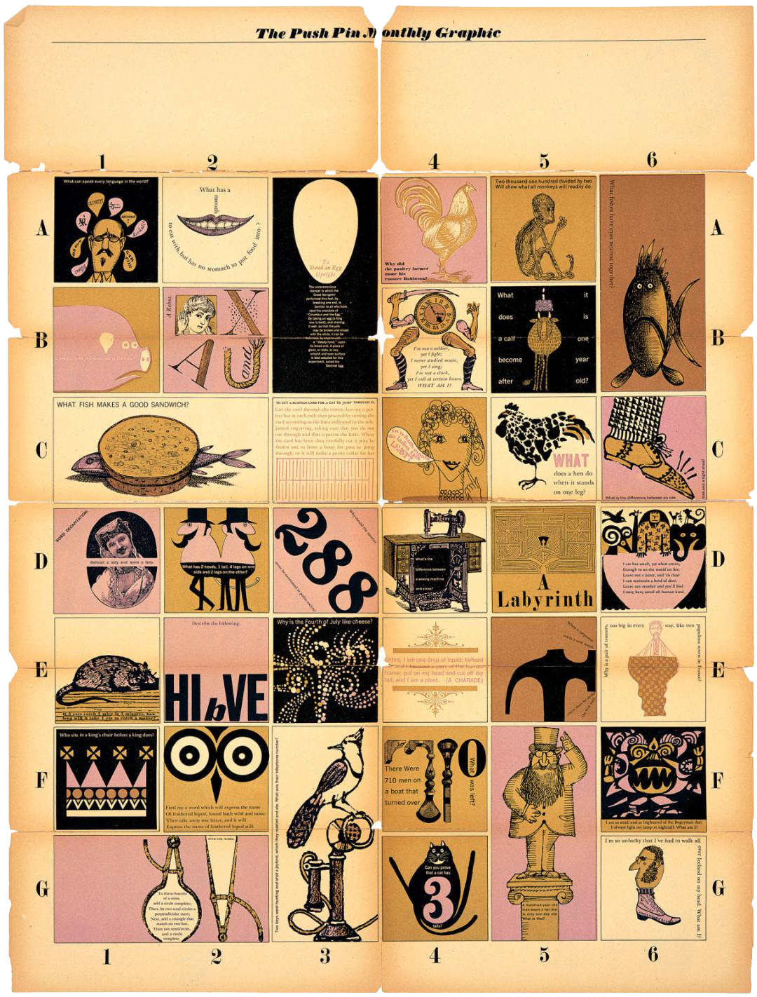
Seymour Chwast, Cover for The Push Pin Monthly Graphic #24, “Entertaining Boxes,” 1959. Courtesy of Seymour Chwast. © Seymour Chwast.
His ABC and counting books, for example, have flowed directly from his long-standing fascination with the potential of typefaces and number forms to take on expressive lives of their own. When asked what inspired the joyful, Pop-inflected Alphabet Parade, Chwast replied cryptically: “I saw a letter B with legs.” The B in question turns out to be one of several matchstick letterform figures created in the 1920s by German avant-garde artists Kurt Schwitters, Kate Steinitz, and Theo van Doesburg for a special children’s issue of their magazine Merz.5 The story Schwitters and his collaborators cobbled together on that occasion, “The Scarecrow,” is a ham-fisted political allegory in which the title character (symbolizing the old European imperial order) is pecked to death by a rooster (meant to stand for the forward-thinking working class). While as children’s literature “The Scarecrow” had no legs whatsoever, the group’s playful letterform experiments did indeed represent a shape-shifting innovation—one that Chwast and other designers have been excited to build on ever since.


Kurt Schwitters, Kate Steinitz, and Theo van Doesburg, Merz no. 14/15: Die Scheuche (The Scarecrow), 1925.
A second group of Chwast picture books have as their point of departure an impulse familiar to graphic designers. Eric Carle traced the origins of The Very Hungry Caterpillar’s die-cut holes to a design challenge he had set himself well before anything like a storyline for that book had formed in his mind. Starting, Carle recalled, with “just a plain sheet of paper” and the restless dissatisfaction he felt in its presence, “I want[ed] to change that flat sheet any way I [could]. That is how the designer in me came to do holes.”6

Seymour Chwast, Illustration for Tall City, Wide Country (Creative Editions). Seymour Chwast Collection, Washington University Libraries, Department of Special Collections. © 2013 Seymour Chwast.
Chwast offers a similar account of the genesis of Traffic Jam, Keeping Daddy Awake on the Way Home from the Beach, Going Home, and other books that break the mold of the traditional 32-page picture book format. All incorporate novelty gatefolds, shaped pages, and even illustrations that can be properly viewed only by turning the book sideways or upside down. He first tried his hand at making “books where things happen” in 1971 with two collections of classic nonsense rhymes, Mother Goooooose and Limerickricks. Yet, according to Chwast, it was not until after viewing the 1989 retrospective of the art and design work of the great Italian polymath Bruno Munari, at the Museum of Jerusalem, that his feeling for “books as objects” fully crystalized.


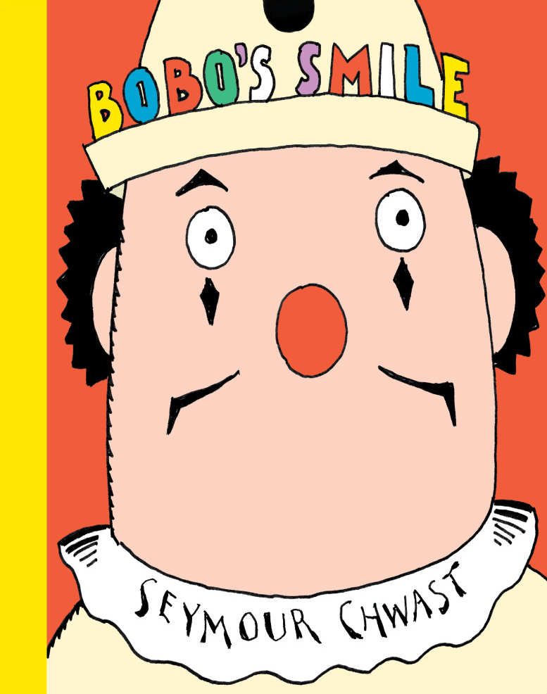
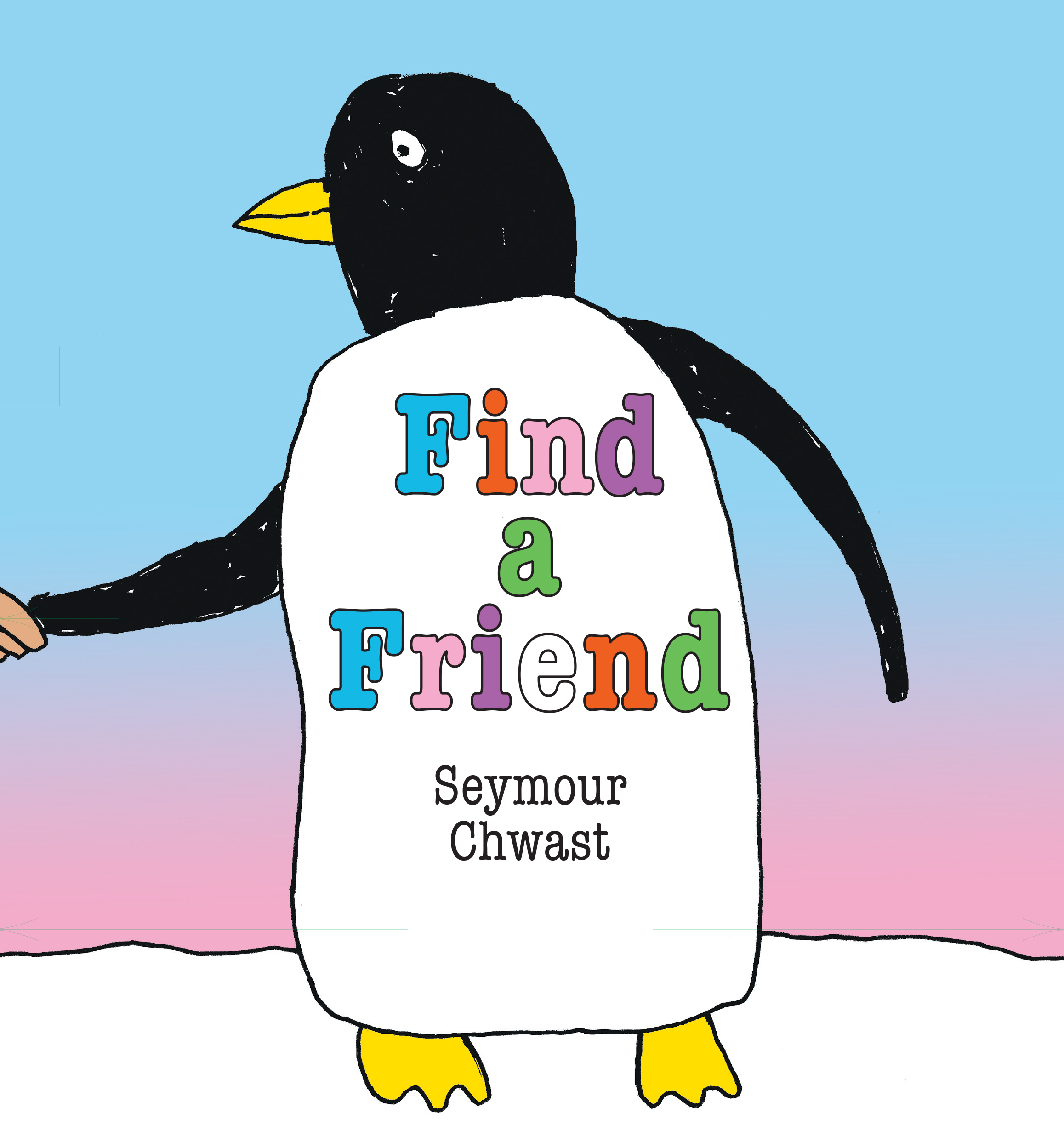
A third set of Chwast books look back, however obliquely, to the artist’s childhood affection for tales of colorful characters and their adventures—the kinds of stories he first encountered at Saturday movie matinees and in the comics and Sunday papers available at newsstands. Character-driven books like Moonride, Bobo’s Smile, The Pancake King, Arno and the Mini-Machine, and Find a Friend resulted in some of his most memorable—and poster-like—cover designs.

Seymour Chwast, Cover for Find a Friend (Astra). Courtesy of Seymour Chwast. © 2023 Seymour Chwast.

Seymour Chwast, Illustration for Find a Friend (Astra). Seymour Chwast Collection, Washington University Libraries, Department of Special Collections. © 2023 Seymour Chwast.
There is, in any case, a soulful sweetness to Chwast the storyteller. Find a Friend reads—tongue-in-cheek yet ever so tenderly as well—as a how-to guide for lonely but intrepid children who long for a playmate. The earnest boy in the deadpan pictures wanders the world and even goes to the moon in dogged pursuit of his quest—before realizing that the boy and girl living next door would do just fine and are probably just as eager to make friends as he is.
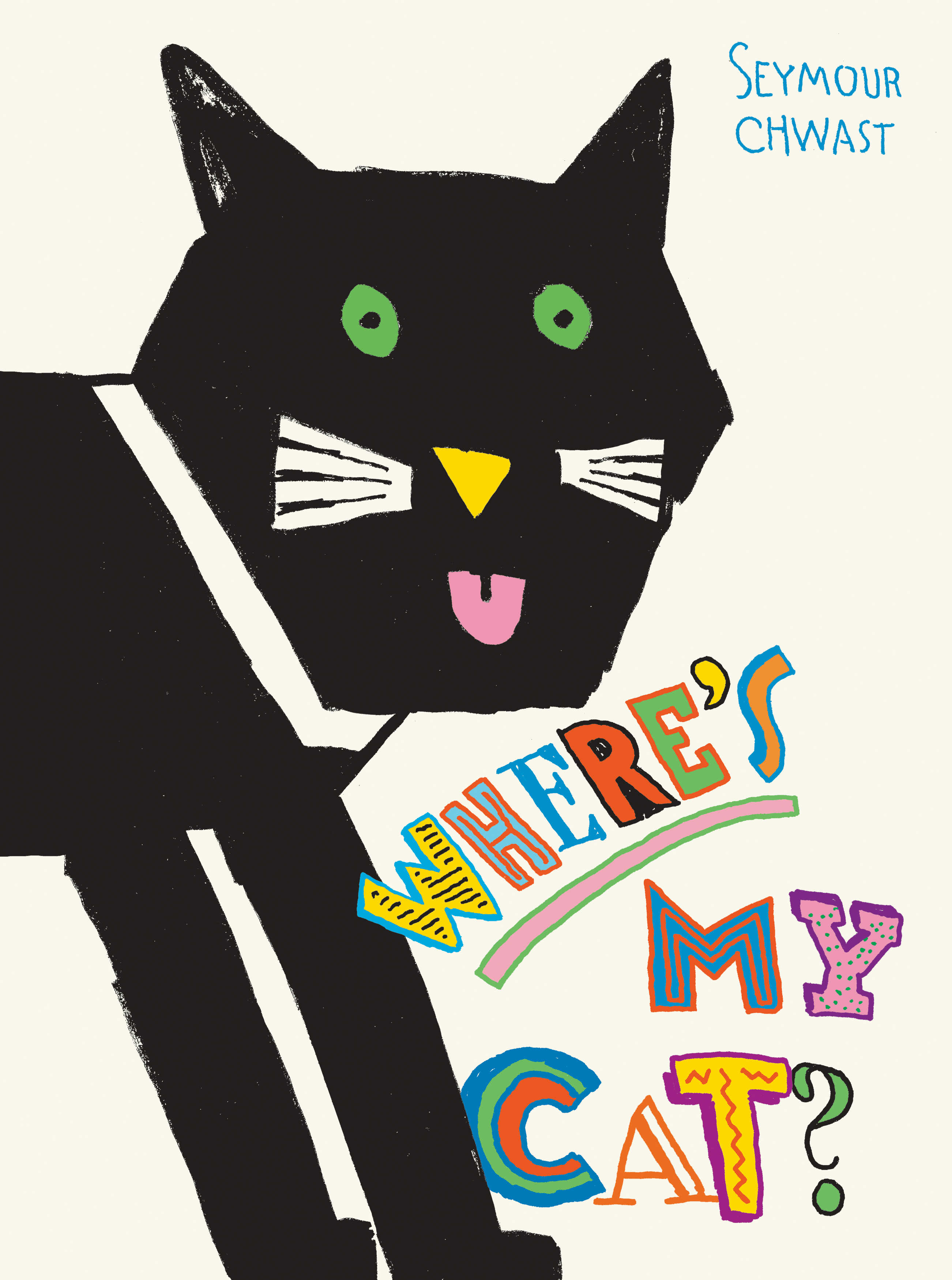
Never one to be pegged, Chwast recently illustrated and co-authored with Steven Heller Hell: The People and Places, a droll cross-cultural Baedeker guide to the underworld. Its appearance in the fall of 2023 follows close on the heels of five picture books for preschoolers, among them Where’s My Cat? and Find Your A: A Hidden Pictures Alphabet Book. “I was a commercial artist [who] always wanted to do books,” Chwast has said of his early Push Pin years. Six decades later, he is a book artist who also does commercial art, creating book after book, each one a surprise that is worth the wait.
Seymour Chwast, Cover for Where’s My Cat? (minedition). Courtesy of Seymour Chwast. © 2022 Seymour Chwast.

1 Steven Heller, “90 Years of Obstinate Creativity,” https://www.printmag.com/daily-heller/the-daily-heller-90-years-of-obstinate-productivity/ posted August 18, 2022.
2 Unpublished author interview with Seymour Chwast, New York, February 16, 2023. Unless otherwise indicated, all Chwast quotes are from this interview.
3 The term “proto-post-Modern,” favored by Steven Heller, is meant to indicate a certain ambivalence on the part of Push Pin designers about Modern modes and ideals. Like the Modernists, they too wanted to “make it new.” While they did not adhere religiously to the Modernist “New Typography,” they at times found it useful for their purposes. Email exchange with Steven Heller, August 30, 2023.
4 Steven Heller quoted in Seymour Chwast, The Push Pin Graphic: A Quarter Century of Innovative Design and Illustration (San Francisco: Chronicle, 2004), p. 11.
5 Kurt Schwitters, Kate Steinitz, and Theo van Doesburg, “Die Scheuche” (The Scarecrow), in Merz 14-15 (Hanover: Aposs-Verlag, 1925).
6 Leonard S. Marcus (editor), Show Me a Story: Why Picture Books Matter (Somerville, MA: Candlewick, 2012), p. 72.

